
Client
Pharmalife
Software
- Illustrator
- Photoshop
- Shopify
- Adobe XD
Year
2023
Leverancer
- Visual identity
- Branding
- Webshop/Shopify
Natural wellness, designed with care
PharmaLife was created with the ambition of making natural wellness accessible through clean and thoughtfully developed CBD products. The task was to develop a visual identity that balances the natural with the scientific — and builds trust from first glance.
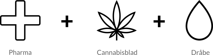
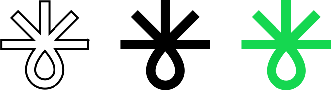
The logo was designed as a fusion of a cannabis leaf, a pharma symbol, and a droplet, together telling the story of the product’s origin, function, and purity.
I set out to create a brand where the calm of nature and the precision of science merge into a single visual narrative — with a focus on trust, quality, and modern wellness.
The goal was to develop an identity that feels both natural and professional. Through a balanced combination of clean shapes, modern typography, and a dynamic color palette — including a vibrant green (#15D74F) — a distinctive yet trustworthy expression was created.
The result is a cohesive brand universe where everything from logo to packaging and digital experience works together to position PharmaLife as a safe and contemporary choice.


A brand  where nature
  meets science – and trust
  is designed

Elements
Result
Colors
#04143B
#8AE5E5
#173620
#15D74F
#556283
#D0F0F0
#548262
#B9EFC9
#A8B0C4
#AED1B9
Cobalt
#0048bd