
Madhytten
Company
Madhytten
Software
- Photoshop
- Lighrooom
- Illustrator
- Indesign
- Adobe XD
- Figma
Year
2020-2026
Deliverables
- Branding and visual identity
- Logo and design guidelines
- Website and web design
- Landing pages and conversion optimization
- Campaign materials (digital and print)
- Newsletters
- Photo and video
- Vehicle wraps and wall graphics
- Flyers and sales and marketing materials
Visual solutions that create clarity and drive action.
I developed a new visual identity and optimized Madhytten’s digital presence with a focus on increasing inquiries, engagement, and conversions.
Madhytten lacked a digital presence that converted.
The website and visual identity did not support the user’s decision-making process — the structure was unclear, the messaging vague, and the path to contact too long.
I rethought the digital experience with a new website, an updated visual identity, and a content structure designed to guide users toward inquiry and selection of a lunch solution.
After launch, the solution was continuously optimized based on user data and heatmaps, where adjustments to the hero section and content flow improved both scroll behavior and engagement.
The result was a significant increase in inquiries, higher-quality traffic, and a more effective, conversion-driven user journey.
More inquiries and better traffic
A marked increase in leads, along with higher-quality website traffic
Increased engagement and improved user behavior
Longer session durations, improved scroll behavior, and increased interaction with call-to-actions
A more effective and trustworthy user journey
Reduced friction through clear structure and enhanced credibility through visual elements
Colors
#25593b
#08ac58
#D09439
#6E4E1E
#E5F0E7
#EAEEF2
Typography
Logo redesign
From a classic logo to a modern, scalable identity
By combining “M” and “H” into a single visual element, the logo became more efficient in use — with a focus on visibility, scalability, and stronger brand presence.
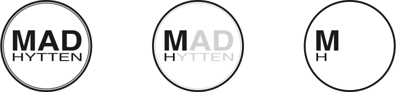
Old logo
An outdated expression with limited flexibility
The previous logo was designed as a circular badge centered around the name. While it offered recognizability, it lacked flexibility and was not optimized for digital platforms.
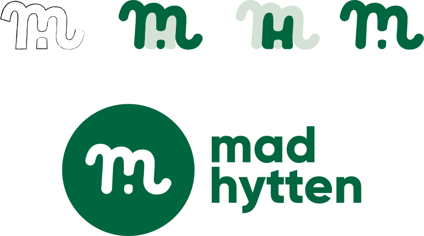
As part of the redesign process, I used the initials “M” and “H” as the foundation for a new logo concept.
New logo
A modern and scalable logo concept
The new logo combines “M” and “H” into one compact symbol, focusing on simplicity and recognizability.
The result is a more flexible and contemporary logo that works effectively across both digital and physical platforms.


UX/UI
PHP
Frontend development
Digital solution focused on flexibility and self-service
A tailored lunch system that makes it easy for customers to manage their own setup — with a focus on usability, clarity, and efficient handling.
Self-service made simple and effective
To make it easier for Madhytten’s customers to manage their lunch arrangements, a digital system was developed where companies can customize and update their orders themselves.
The solution is designed with simple navigation, clear structure, and quick actions in mind — allowing users to easily adjust quantities, select products, and maintain an overview of their orders.
At the same time, the backend system provides Madhytten with an efficient tool for managing customers, production, and logistics, where data and orders are consolidated in one place.


