
DKTV
Company
DKTV A/S
Role
Grafisk designer (marketing)
Software
- Illustrator
- Photoshop
- Lighrooom
- After effects
- Indesign
- Adobe XD
- Figma
- Agillic
Year
2015-2025
Area of responsibility
Responsible for the development and maintenance of DKTV’s visual identity and graphic expression across digital and print platforms.
Deliverables
- Branding and visual identity
- Website and web design
- Campaign materials
- Newsletters
- Photo and video
Solutions that not only work visually but actively contribute to business results.
At DKTV, I worked on developing and strengthening the company’s visual identity across all platforms. From a marketing perspective, the task was to create an expression that was recognizable, professional, and easy to work with in a fast-paced environment — from digital campaigns to printed materials.
The goal was to create a cohesive visual direction across all touchpoints — from website and newsletters to campaigns, photo, and video — with a focus on improving user experience and supporting action.
In a context of technical products and complex messaging, I worked on simplifying communication and building a clear visual hierarchy, enabling users to quickly understand the value and navigate आगे. There was a strong focus on clear messaging, visual hooks, and distinct call-to-actions.
I developed a flexible visual system that could scale across channels and formats, making it possible to continuously produce and adapt content. This created a strong foundation for both consistency and optimization — where messaging and visual elements could be tailored to context and purpose.
Through ongoing production and iteration, design became an integrated part of the marketing effort — where visuals were not just about aesthetics, but about reducing friction, increasing engagement, and improving the likelihood of clicks and conversions.
Colors
Midnight Blue
#001230
Port Gore
#231d49
Port Gore
#231d49
Purple
#622161
Maroon flush
#cc2458
Cobalt
#0048bd
Curious Blue
#2699fb
Shamrock
#3ecb8f
Peach
#f3e9e6
Typography



DKTV Rebranding
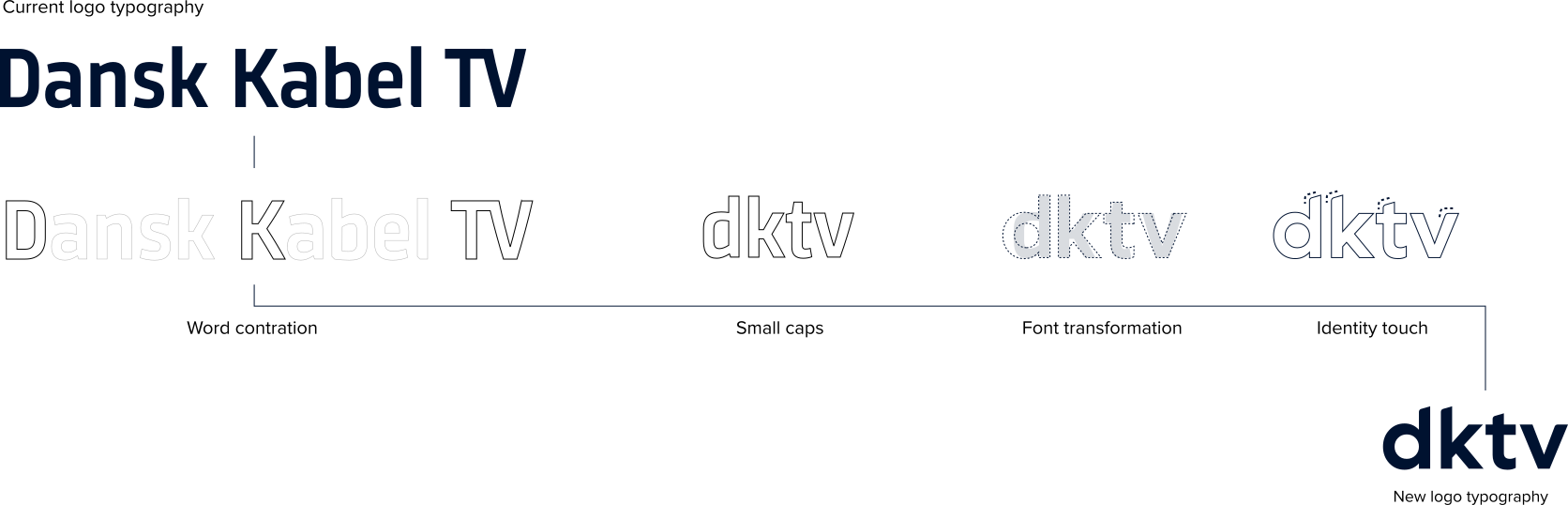
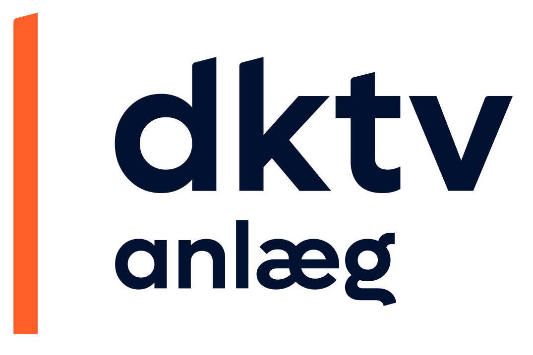
The rebranding of DKTV was based on a desire to modernize the existing visual identity without losing the recognition the company had already built. The task was to redesign the logo with a more contemporary and digitally optimized expression, while preserving the iconic element — the orange line — as a key visual feature. The result is an updated identity that balances continuity and renewal, strengthening DKTV’s position in a modern market.
Typography
The typography was selected with a focus on a modern and highly readable expression. A geometric typeface was chosen to support the brand identity while performing consistently across both digital and print platforms. The result is a clean and sharp typographic style that contributes to a more contemporary visual expression.
Element
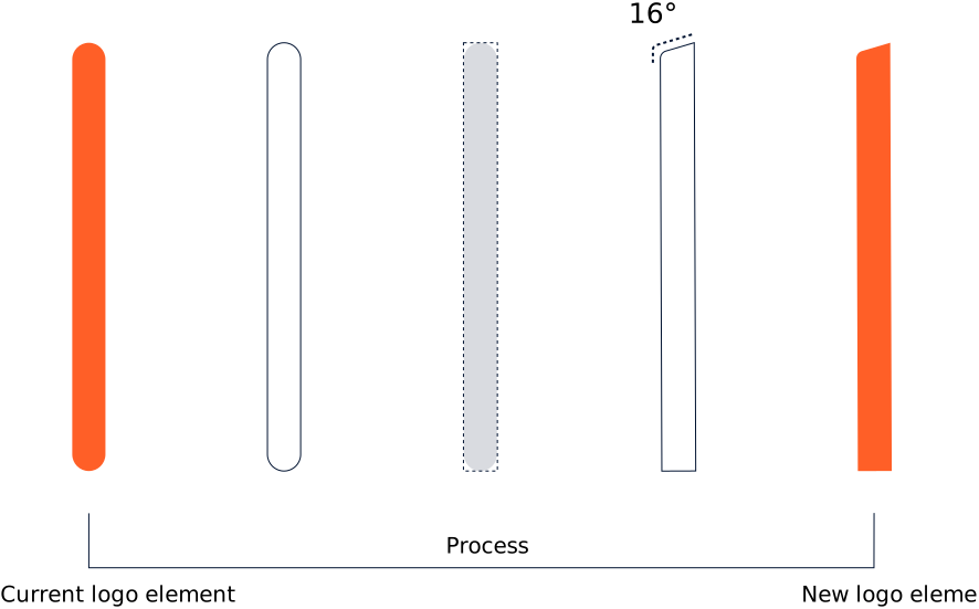
The orange line has been retained as a central element, directly referencing the existing line in the “D” of DKTV’s logo. In the redesign process, it has been refined and more naturally integrated into the new identity, preserving recognizability while giving the overall design a more modern and streamlined appearance.




Produceret for DKTV. Rettigheder tilhører DKTV. Vist som reference af udført arbejde.